

With a complete interior facelift The Captain required a whole new branded identity and we were tasked with creating logo, branded collateral, menu design – the works. The concept that the client eventually chose was inspired by old sailors and seadogs who were notorious for keeping detailed journals of their travels and endeavours. The direction used a typographic treatment which was inspired by the handwritten diary entries written while at sea. The loose, rough, and unapologetic scribble is a unique nod to the venue’s name without using any cliche, overused nautical symbolism.
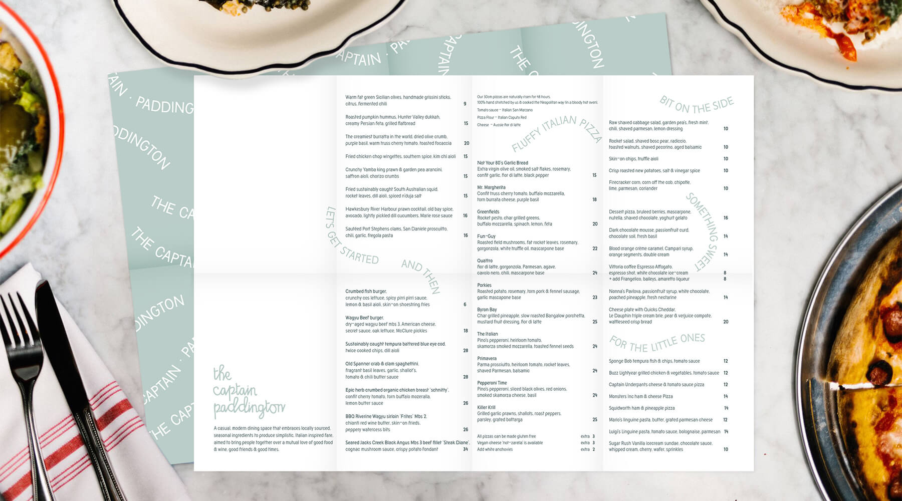
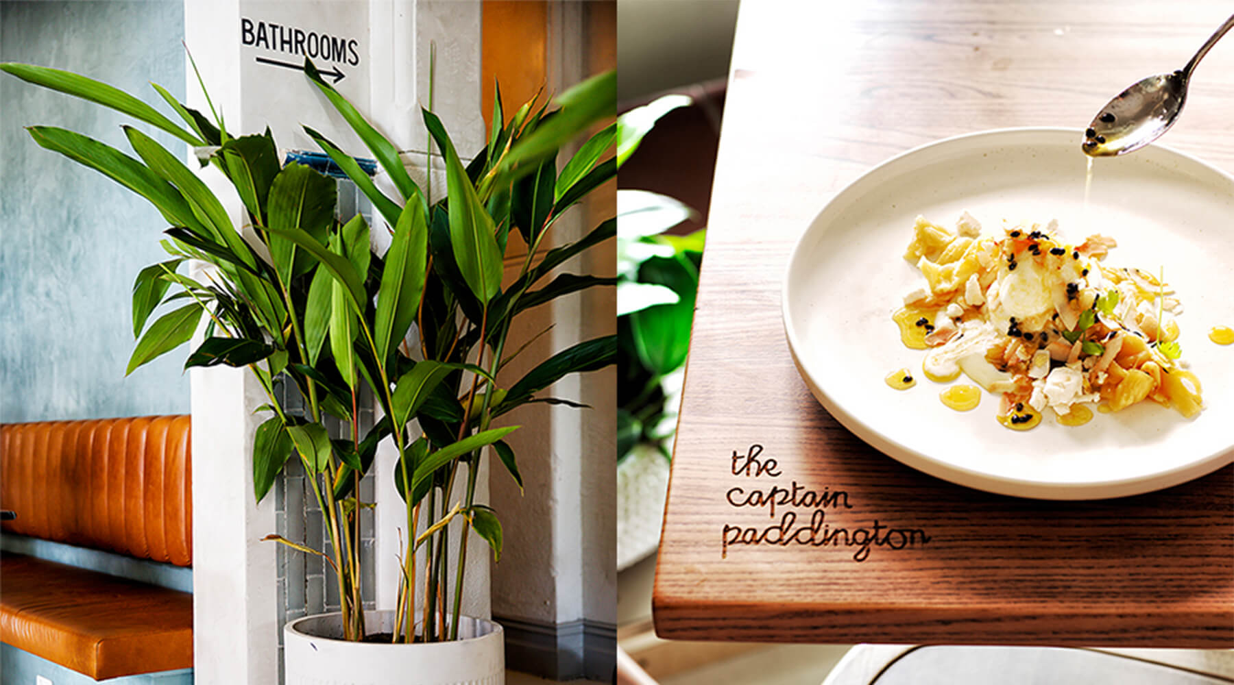
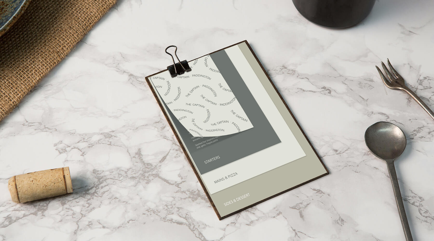
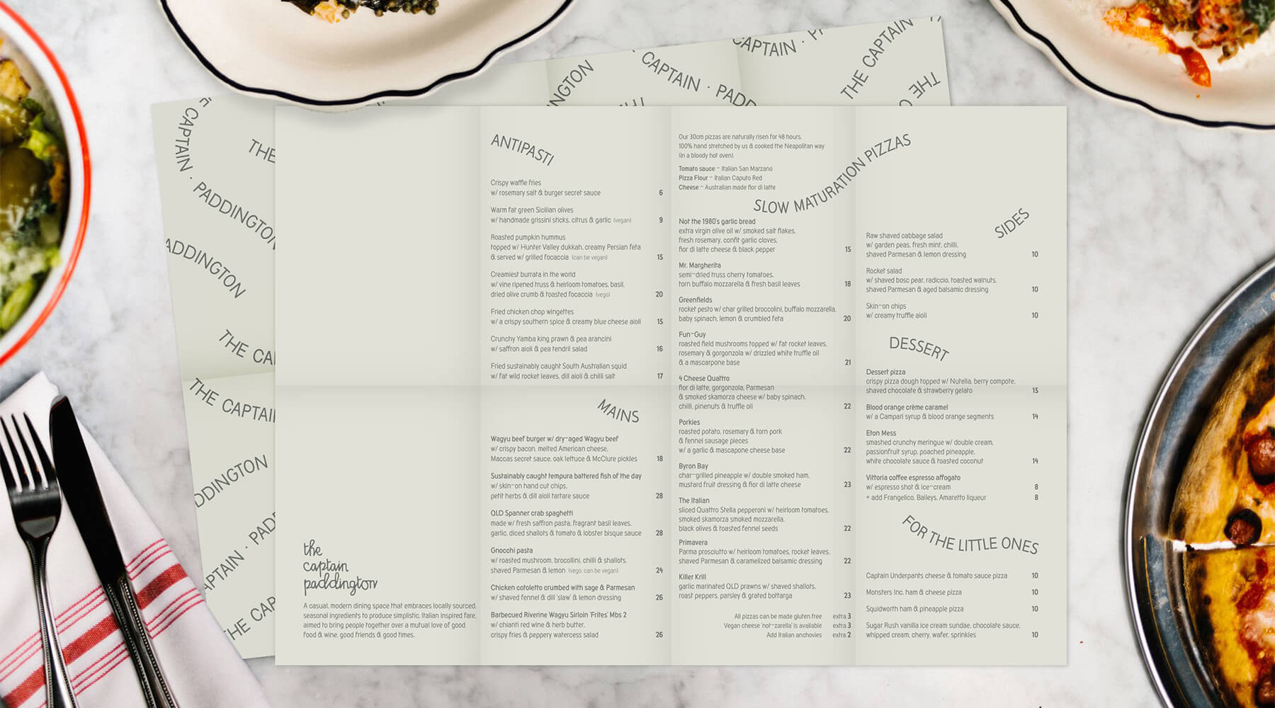
This concept and typography was rolled out across the whole venue – from hand painted logo signage on the windows and floor transition strips, tables etched with the logo, recalled mercury mirror and layered menus displayed on wooden clipboards form easy up dates on weekly changing food offerings. The branding application rolled out in this way completed the refurbishment of the the hotel and added a symbiosis and synergy between the interior and the offering.